CLAIR Color Palettes
Three curated design systems that define CLAIR's visual language. Each palette creates a distinct mood and application context while maintaining brand consistency and accessibility standards.
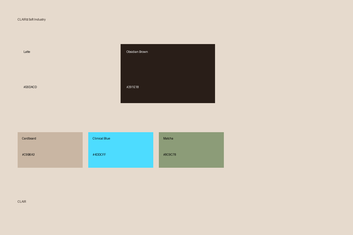
Live Palette Demonstration
This page is designed using Palette 03: Soft Industry to demonstrate proper color usage proportions (50% Latte background, 30% Obsidian text, 10% Clinical Blue interactive elements, 10% accent colors) and UI/UX best practices in a real application context.
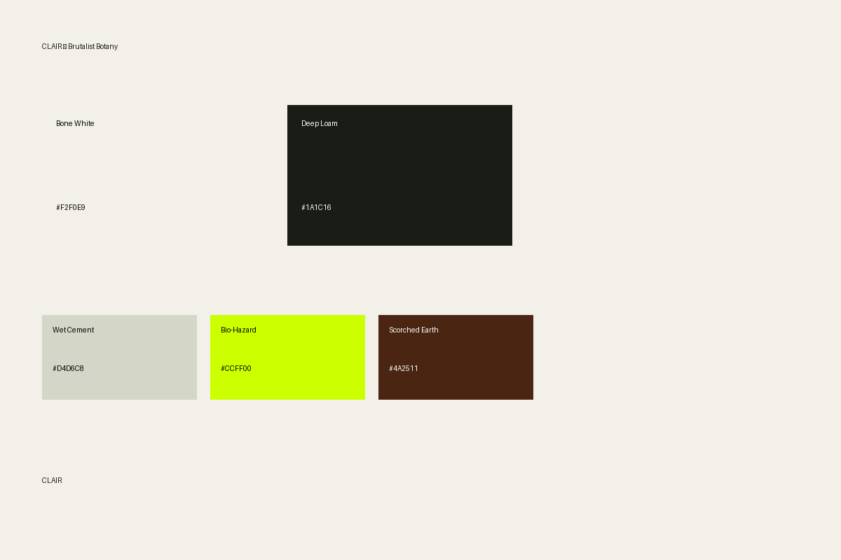
Palette 01: Brutalist Botany
Bold, organic, high-contrast design system with nature-inspired earth tones and neon accent
Color System
Character
Bold, earthy, organic with shocking neon accent. Grounded yet disruptive, organic meets synthetic.
Best For
Brutalist design, nature-tech fusion, bold statements, marketing campaigns
Accessibility
✓ Deep Loam on Bone White: WCAG AAA (21:1) • ✓ Bio-Hazard on Deep Loam: High visibility • ⚠ Bio-Hazard on Bone White: Large text only
Usage Proportions
Gradients
Tones & Hues
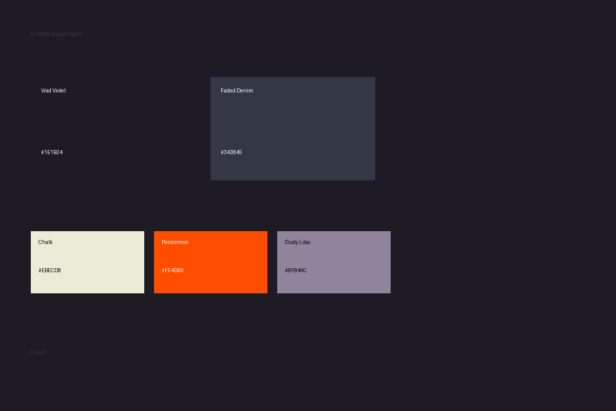
Palette 02: Analog Night
Dark, moody, sophisticated design system with warm analog feel and vibrant accent
Color System
Character
Dark, sophisticated, cinematic with warm vibrant accent. Mysterious, sophisticated, warm analog nostalgia.
Best For
Dark mode, premium feel, evening/night usage, sophisticated users
Accessibility
✓ Chalk on Void Violet: WCAG AA+ (12:1) • ✓ Persimmon on Void Violet: High visibility • ✓ Excellent for dark mode
Usage Proportions
Gradients
Tones & Hues
Palette 03: Soft Industry
Warm, approachable, professional design system with soft neutrals and bright interactive accent
Color System
Character
Warm, professional, approachable with bright interactive accent. Warm, trustworthy, soft industrial aesthetic.
Best For
Professional tools, approachable interfaces, daytime usage, main application UI
Accessibility
✓ Obsidian Brown on Latte: WCAG AAA (14:1) • ✓ Clinical Blue on Latte: WCAG AA (4.5:1) • ✓ Matcha: Non-critical text
Usage Proportions
Gradients
Tones & Hues
Recommended Implementation
Start with Soft Industry as the primary palette for the main application:
Soft Industry
Primary application UI, professional tools, daytime productivity. Warm, approachable main experience.
Analog Night
Dark mode alternative, premium tier branding, evening usage. Sophisticated evening alternative.
Brutalist Botany
Marketing campaigns, bold statements, disruptive positioning. Bold differentiation in marketing.