Brand Identity
Complete visual identity system for CLAIR, including logo concepts, color palettes, typography, visual elements, and application guidelines.
Brand Positioning
CLAIR positions itself as a premium dating intelligence platform that empowers users with AI-powered insights before they invest time and emotional energy in matches.
Brand Essence
Intelligent • Insightful • Empowering
Brand Promise
See beyond the profile, make informed decisions
Visual Direction
Modern, sophisticated, trustworthy
Recommended Logo
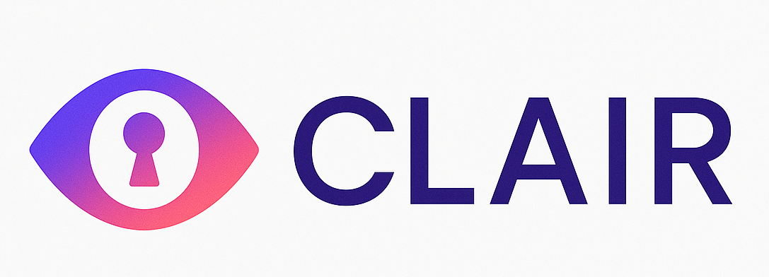
R3: Insight Connection
Eye with keyhole pupil design featuring purple-to-pink gradient. This logo concept best represents CLAIR's core value proposition: seeing beyond the surface (eye) to unlock hidden insights (keyhole).
Eye metaphor: Seeing, understanding, intelligence
Keyhole symbol: Access to hidden information, unlocking insights
Gradient: Modern, dynamic, approachable yet premium
Visual Identity System
Logo System
Stakeholder feedback, 9 refinements (R1-R9), 8 primary concepts, and complete logo guidelines
Color Palettes
Primary and secondary color systems with usage guidelines and accessibility considerations
Typography
Type system with font families, weights, sizes, and hierarchy guidelines
Visual Elements
Icons, illustrations, patterns, and supporting visual elements
Applications & Guidelines
Design Principles
1. Clarity
Visual elements should communicate clearly and directly. Avoid unnecessary complexity that distracts from the core message of intelligence and insight.
2. Sophistication
Maintain a premium, polished aesthetic that reflects the value of the intelligence service. Quality over quantity in all visual applications.
3. Trustworthiness
Build confidence through consistent, professional execution. Users trust CLAIR with sensitive dating decisions—the brand must reflect reliability.